VISUAL IDENTITY+ ARTISTIC DIRECTION
INTRODUCTION
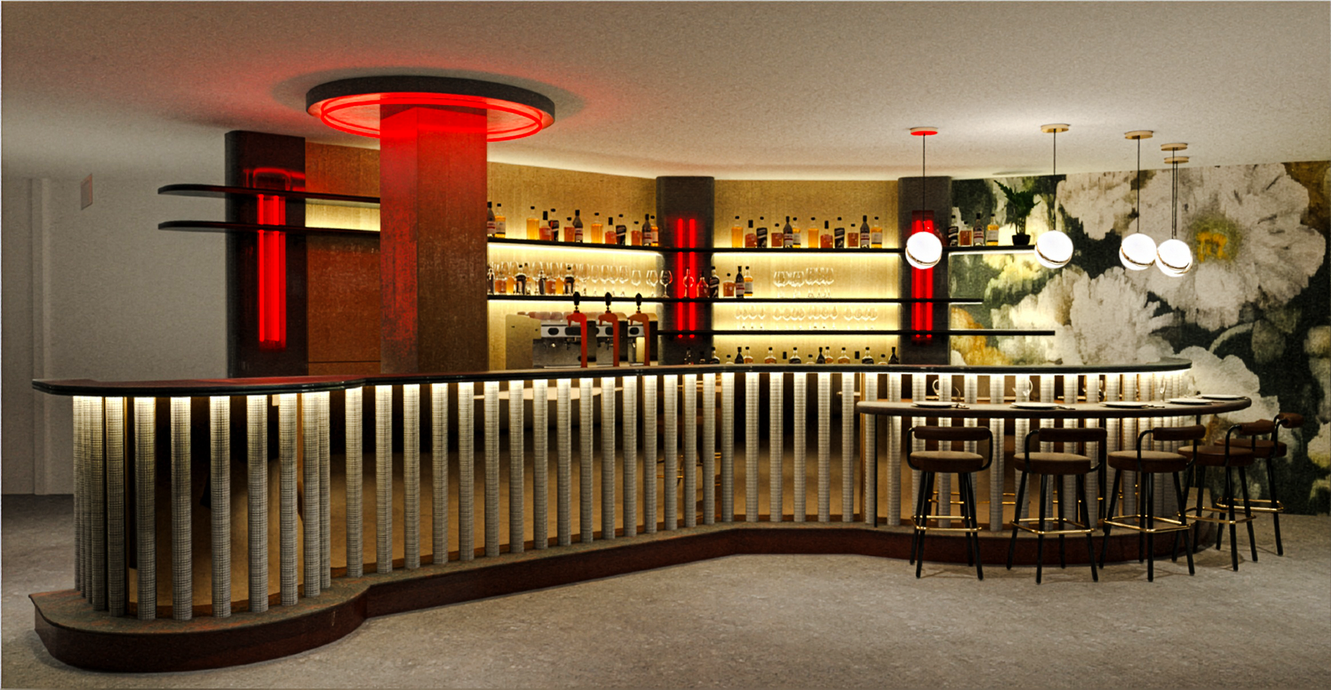
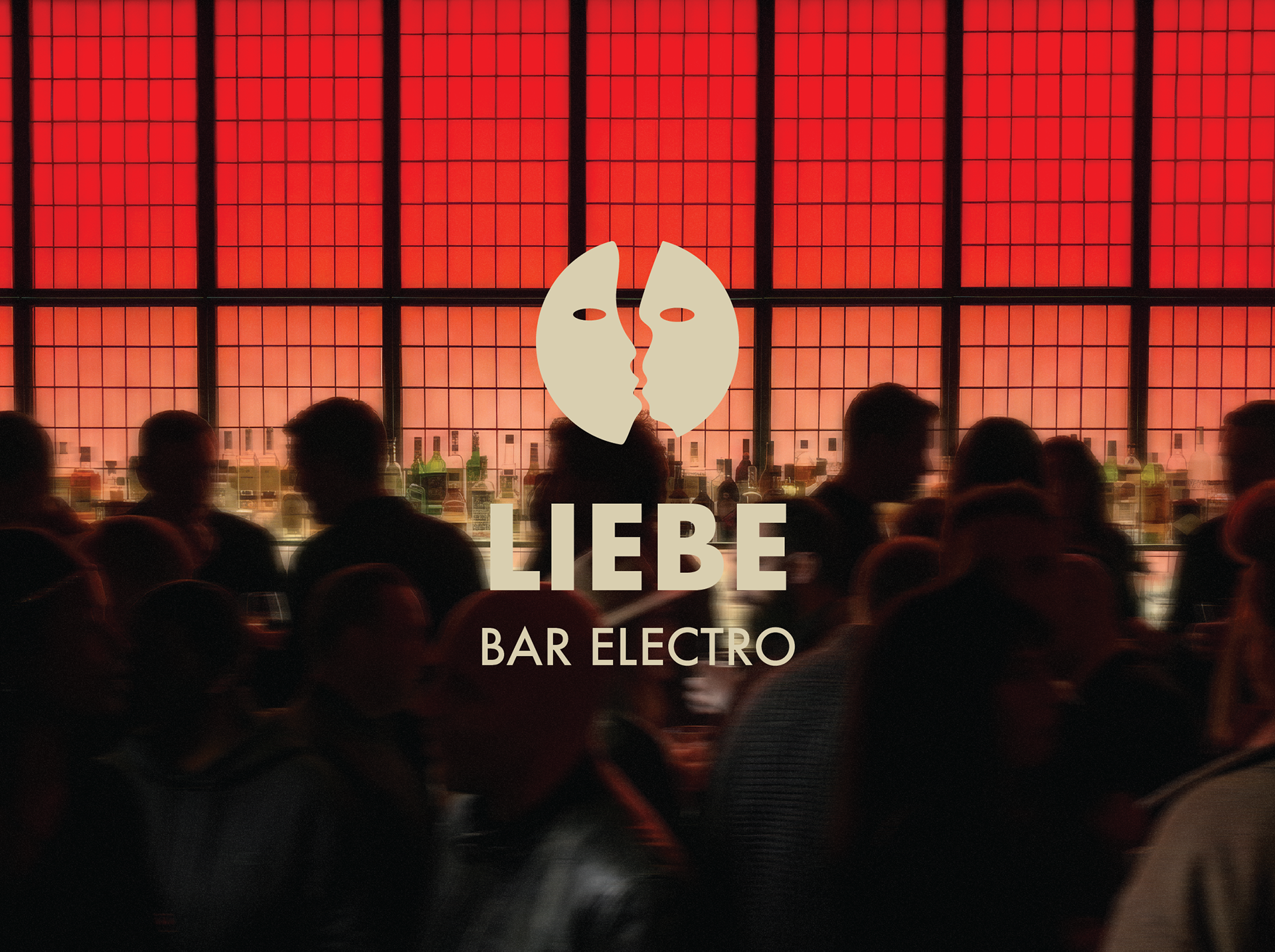
As an art director, I had the pleasure of designing the cultural programming and visual identity of Liebe, a restaurant-bar located in Paris’s 9th arrondissement.
Conceived as a new meeting point for lovers of electronic music and high-quality products, the venue evolves throughout the day: a restaurant by day, a bar in the evening, and a club by night.
The challenge was to translate this multiplicity into a cohesive visual identity one capable of establishing a premium atmosphere while appealing to a diverse audience, ranging from after-work professionals to fashion insiders, as well as creatives and artists.
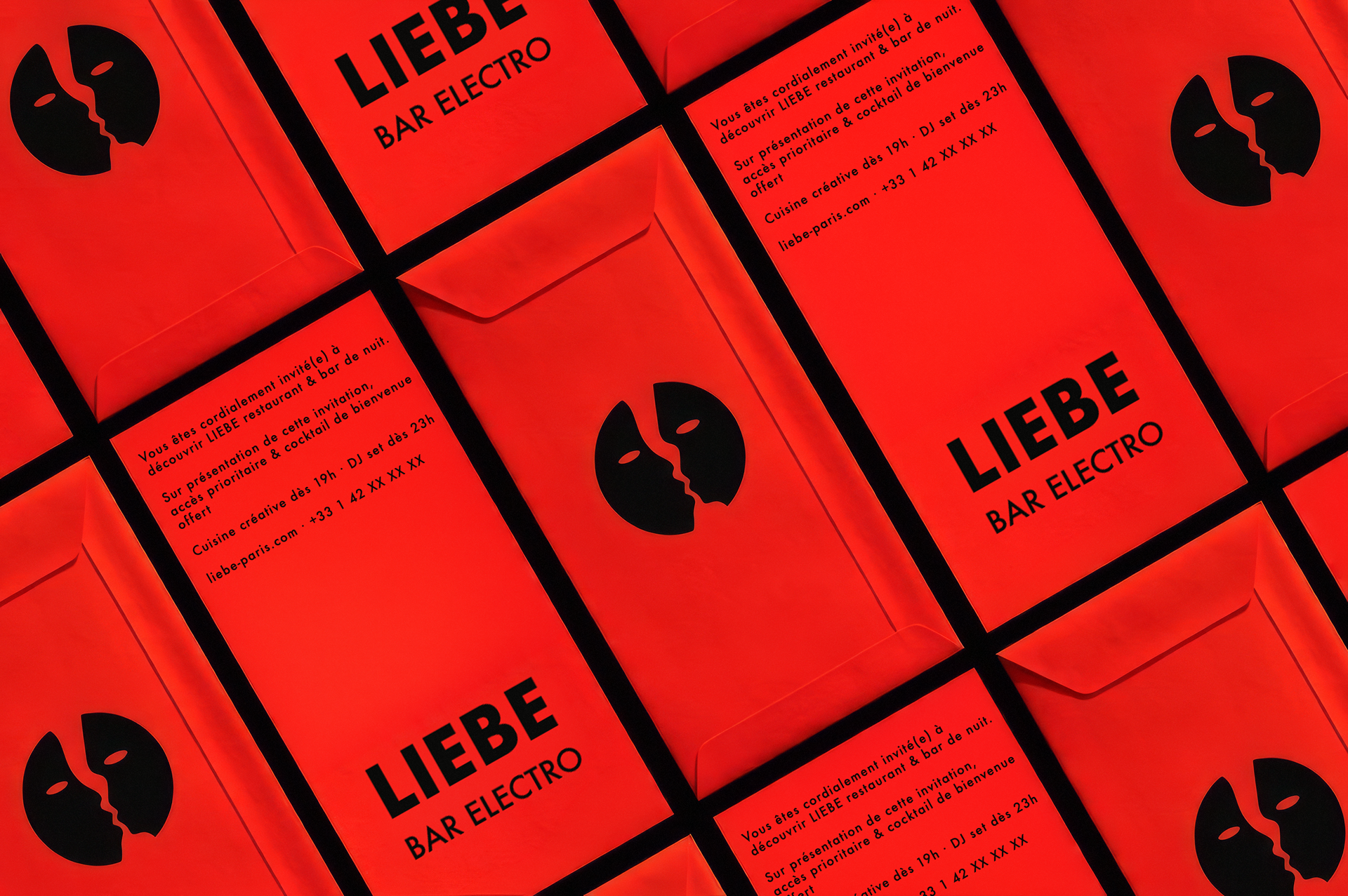
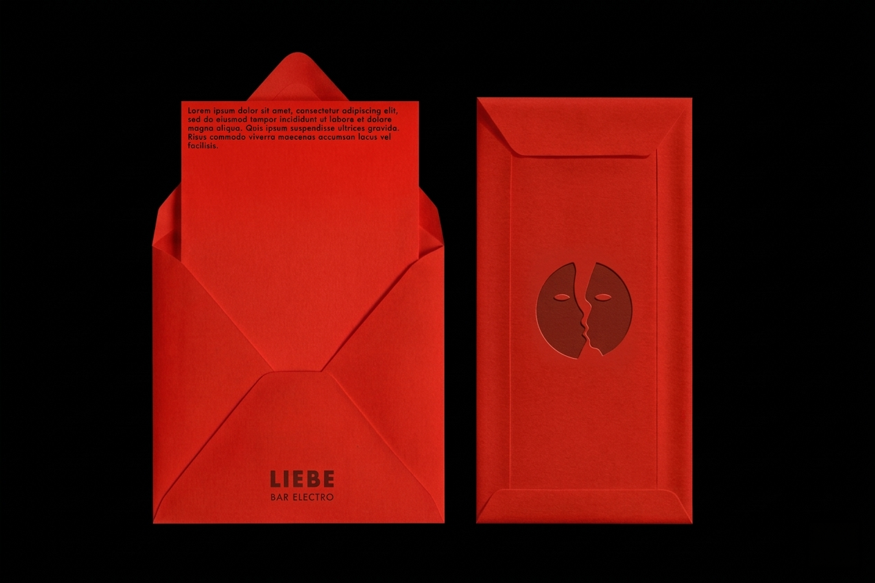
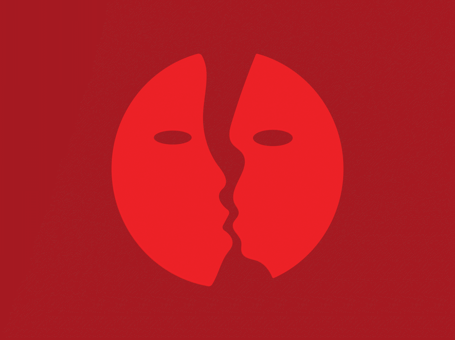
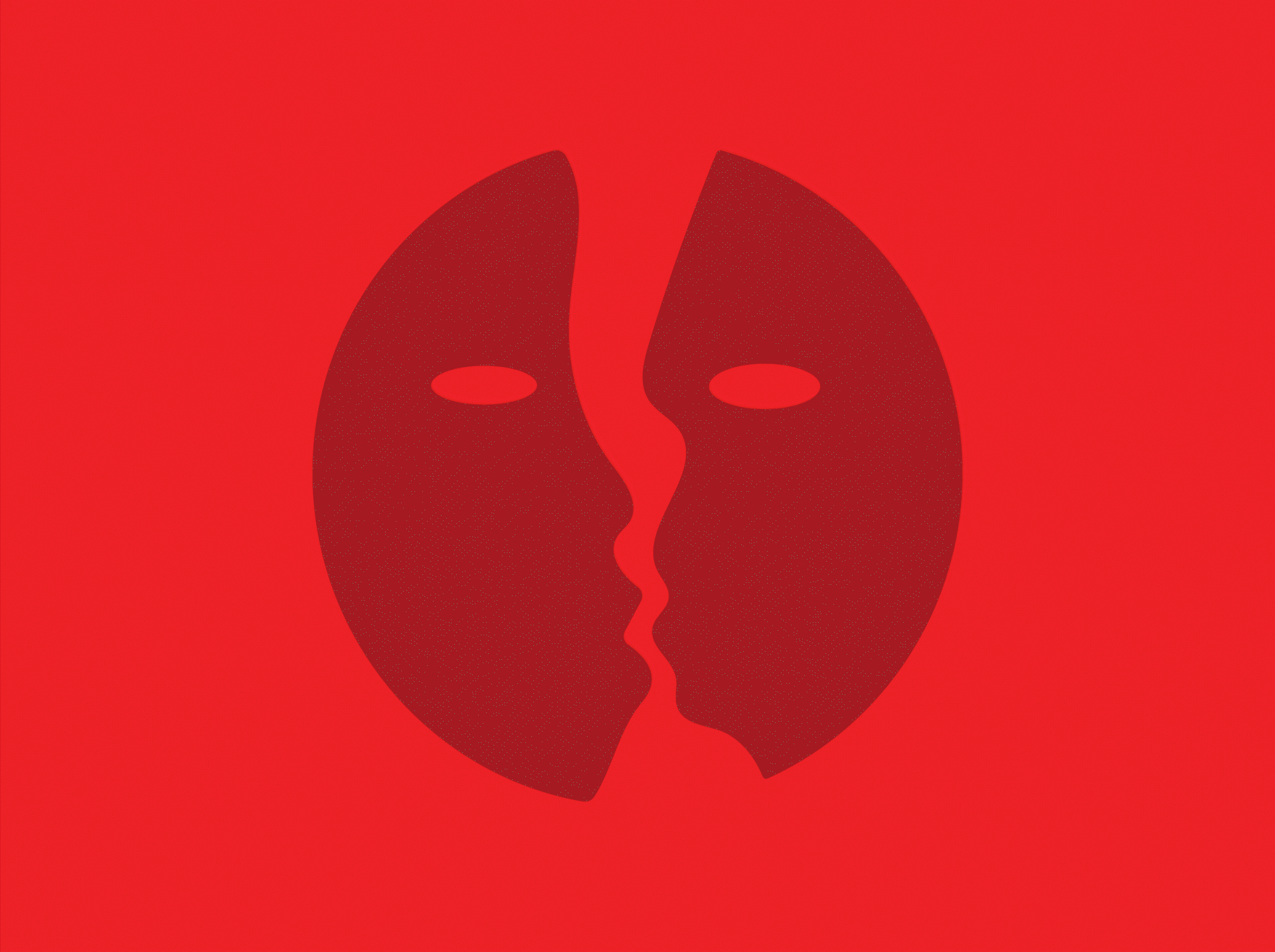
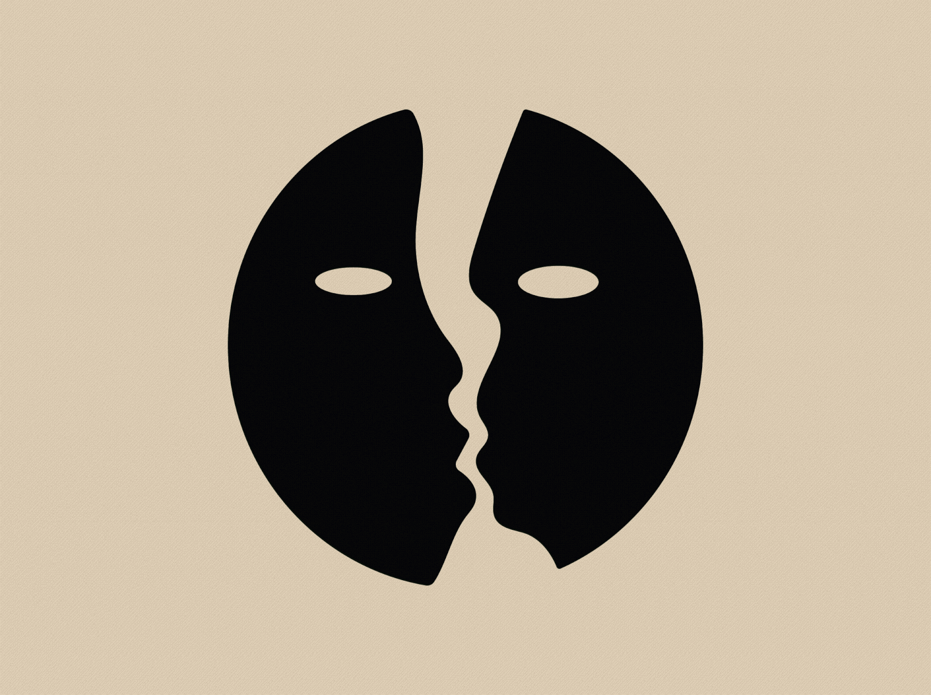
THE LOVE SYMBOL
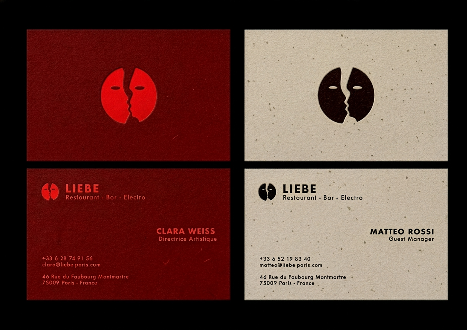
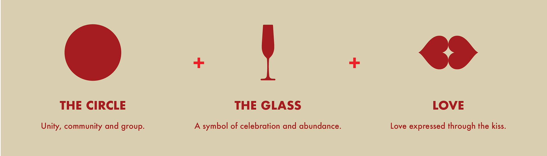
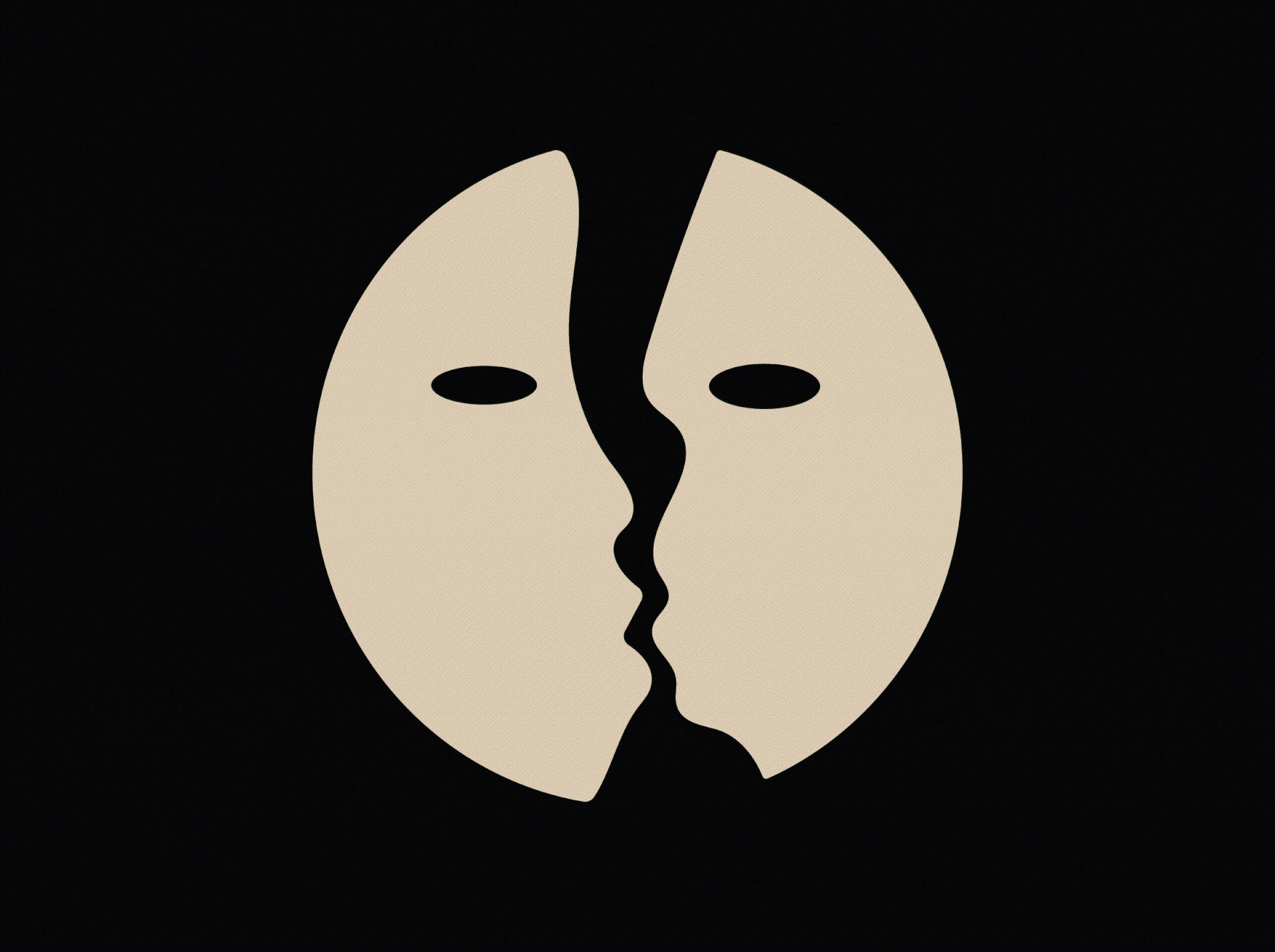
The core symbol of this identity draws from the name of the venue, Liebe, which means “love” in German, as well as the iconic photograph of Leonid Brezhnev kissing Erich Honecker on the lips.
The intention is to distill the different dimensions of love: meet, desire, and kiss into a simple yet evocative sign. As a tribute to the venue’s German DNA, a modernist approach was favored, bringing both rigor and timelessness to the design.
The result is a logo that is both distinctive and legible, capable of integrating seamlessly across a wide range of visual contexts.


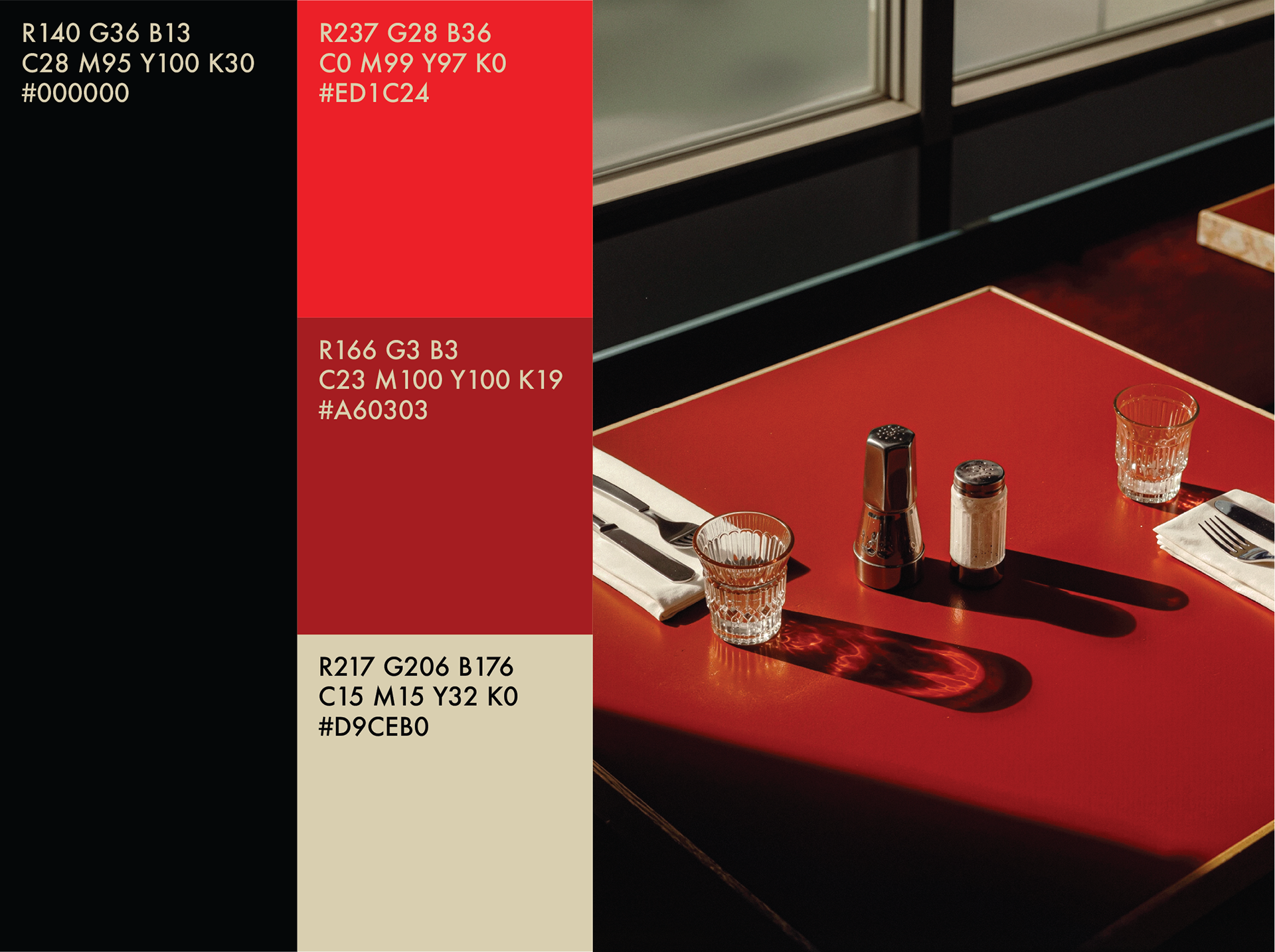
A CHROMATIC PALETTE THAT EVOKES LOVE
Red, as the ultimate expression of passion, defines the core of the visual identity. It unfolds through two nuanced tones, complemented by a deep black and a soft cream hue, resulting in a refined balance between intensity and elegance.
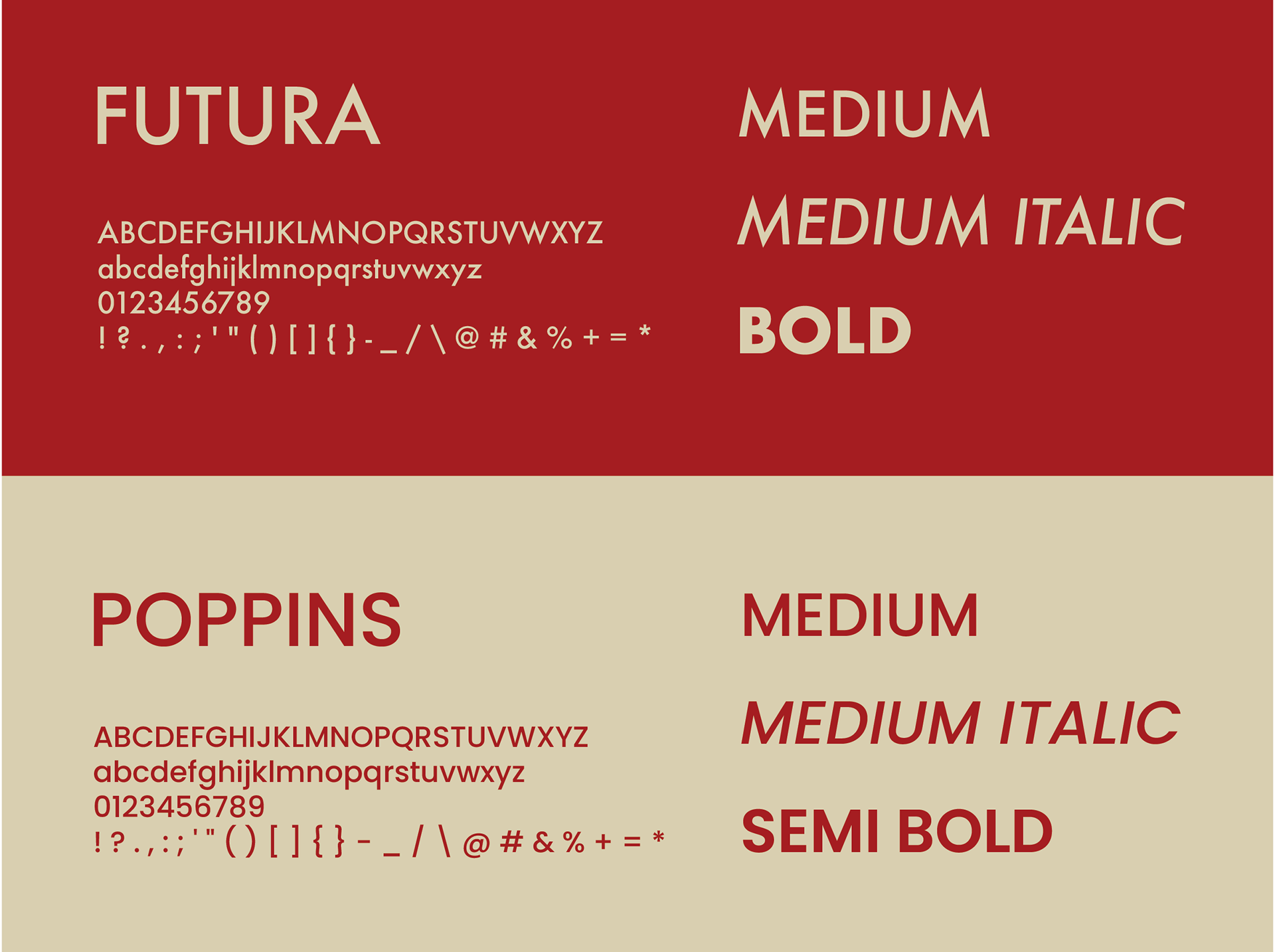
A FLEXIBLE AND MINIMAL TYPOGRAPHY
To structure and strengthen the brand’s visual universe, two complementary typefaces were selected: Futura and Poppins. Futura serves as the primary typeface.
With its geometric and refined design, it embodies a modern, clear, and timeless aesthetic, perfectly aligned with the bar’s identity.
Poppins acts as a substitute typeface. When Futura cannot be used across certain digital platforms, Poppins ensures visual consistency through similar shapes and excellent readability.
Both widely available across design and communication tools, these typefaces strike a balance between accessibility and distinctiveness. Their combined use guarantees a cohesive graphic identity, capable of adapting to a high volume of communication while maintaining a controlled and contemporary image.